Coursework
Monday 3rd May
LO - to explore possible tasks and research similar products
1 - create a front cover and a double-spread page article for a health and fitness magazine aimed at an audience primarily of 14-18 year old
3 - create a homepage and one linked web page for a health and fitness website targeted at an audience primarily of 14-18 year olds
 |
| mental health |
 |
| fitness |
Wednesday 10th May
LO - to research codes and conventions of similar products
 |
 |
 |

 |
What kind of articles do they include on the front page?
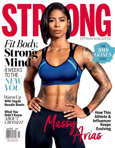
the front cover include articles like sports, nutrition, workout routines, physical and mental health
What is on the cover: objects, activities, models or celebrities?
all of the magazines have a fitness model showing the effects of the magazine, usually in cropped clothes
How is the colour scheme chosen?
most of the magazine stick to 2-3 colours only and not a full range of colours
Where is the masthead and what kind of font is used?
The masthead is always at the top, and they tend to use sans serif font
How many images are on the cover?
There is usually only one image on the cover and that is the model or person
How many cover lines are used?
each magazine contains at least 5-6 cover lines
What institutional information is included and where is it placed?
the barcode is seen to be always set on the bottom of the magazine left or right depending on the image of the front cover
How many different fonts are used on the cover and how do they vary?
it usually sticks with one different font throughout the whole of the front cover, but the text size usually varies depending on if it is a cover line, the masthead, or the main cover line
How are puffs used?
The main image is used to attract an audience that are interested in fitness. along with the bold text that stands out
 |
 |
 |
 |
 |
 |
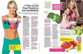
How many DPSs laid out?
they usually include a couple of images and text to portray the meaning of the DPS
How many images are used in DPSs?
most of the DPSs use up to 4-5 images based off the DPS
How many different fonts are used on the DPS and how do they vary?
the main idea of the DPS in portrayed using large size text and a different colour to stand out, while the body is written in a small size and serif font types
How is the text organised in a DPS?
the text is arranged in column view (grid layout) and is written in black so it stands out from the background
Wednesday 7th June
MAGAZINE ONE
What house style (characteristics used to differentiate the brand from other) is established by the use of font/colour/images/layout?
the main image is used to portray the meaning of the magazine
production values (are they high, mid or low)
high
what ideologies are represented? (the values & aspirations [ideas & goals that are important to people] they present to the audience) link to target audience
fitness and food plans
how is colour palette & typography used
throughout the magazine a sans serif font is used, except the masthead which used a serif font. it mostly used a bright colour palette to convey positivity
how are the people or areas featured represented?
because it is a fitness magazine they are to look fit and healthy to show the outcome of the magazine
who is the target audience and how does it appeal to them?
this magazine targets adults, this is shown through the main image, which is an adult women. This would appeal to adults because of the age similarity
How can you tell that the cover and DPS come from the same magazine?
The cover and DPS highlight that the magazine is about women's health and fitness
MAGAZINE TWO
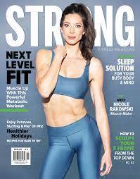
What house style (characteristics used to differentiate the brand from other) is established by the use of font/colour/images/layout?
this magazine uses more cover line to show what the magazine is about, but also uses the main image to convey a more meaning to it
production values (are they high, mid or low)
high/mid
what ideologies are represented? (the values & aspirations [ideas & goals that are important to people] they present to the audience) link to target audience
it consists of catch lines and quotes to get people motivated into health and fitness. the cover lines also do the job of engaging a certain audience
how is colour palette & typography used?
the magazine uses both serif and sans serif throughout their magazine, using black, yellow, pink and blue as their colour palette
how are the people or areas featured represented?
people are represented as health and fit to engage their target audience
who is the target audience and how does it appeal to them?
the main image is a adult, healthy women, this is representative of the target audience being adult women who want to get fit
how could you tell the cover and DPS are from the same magazine?
the cover uses cover lines to tell you what is going to be in the magazine
PLANNING:
style -
typography -
image (shot type and content) - model, different types of sports (long shots)
masthead/logo design -
cover/homepage layout - a main image with quotes and cover lines surrounding it
content - give the reader health or fitness plans throughout the magazine
colour palette -
linked page/DPS layout -
Wednesday 28th June

age range - 14-18 year old
gender - mixed
income / job - any
race - any
education - school
interest - health and fitness
what would they think of school?
they think that it is boring and repetitive
what hobbies would they have?
fitness hobbies and a healthy lifestyle
would they be more likely to live in urban or rural area?
rural areas
what would their favourite subject be?
P.E or health
what is important to them?
getting healthy and fit
how would they use social media?
they wouldn't use social media regularly
how would their friends describe them?
fun and outgoing
why would your project appeal to them?
the magazine is based on health and fitness which is what they are into

Wednesday 12th July


Wednesday 13th September
LO - to recap brief criteria and to explore how to create effective representations
front cover:
original masthead
strapline
cover price, barcode, edition number, original images: at least one main cover image
at least six cover lines one of which must link to the double page spread article
double page spread article
headline, stand-first and sub-headings
use of columns
original images: one main article image and at least three other images
feature article of approximately 300 words that link to one of the cover lines on the front page
how is your cover going to follow the layout conventions of a front cover? it is going to include a masthead and cover lines around the main image explaining what is going to be in the magazine
what is your DPS going to be about and how will it be laid out? my DPS is going to be about healthy lifestyles and a health plan that people can follow
how will the genre of your magazine be made clear over both pages?
TDL:
-take photos for my front cover and DPS
-finish off my front cover design
-work on the columns for my DPS
-start my DPS
Wednesday 27th September
be the better version of you
burn calories fast
Wednesday 4th October
MASTHEAD
Wednesday 1st November
recipes
how to...
workouts
interview
reviews
problem page
article writing
LO - to create a convincing article for a teen health & fitness magazine using appropriate
language, tone and representation
who / what is on your cover?
what is the article about? a healthy and easy to follow recipe
what are the images going to be of? the end product of the meal and guidance pictures of the meal
what page number is going to be at the bottom? page 22-23
will you have the same font as on the cover? no
recipe:
ingredients:
1 tsp cornflour
1 tsp dark soy sauce
finely grated zest and juice 1/2 small lemon
1 skinless chicken breast fillet diced
1 bell pepper deseeded and sliced
1 medium carrot
100g broccoli
150ml chicken stock
4 spring onions trimmed and thickly sliced


RESEARCH:
ReplyDeleteGood research into conventions and strong analysis
TA PROFILE:
Basic but good
PLANNING:
A good start - where's your masthead?
I'd like to see more about how you're going to target teens.